一文带您搞定flutter常用控件
持续更新中(有空的话😄)。。。
Widget的典型属性表
| 属性 | 类型 | 作用 | 其他 |
|---|---|---|---|
| alignment | Alignment | 对齐方式 | Alignment值: topCenter、topLeft、topRight:顶部居中、左、右对齐 center、centerLeft、centerRight:水平垂直居中、左、右对齐 bottomCenter、bottomLeft、bottomRight:底部居中、左、右对齐 |
| backgroundColor | Color | 背景色 | |
| child | Widget | 子Widget | |
| children | List<Widget> | 子Widget集 | |
| color | Color | 颜色 | 常用于背景色 |
| curve | Curve | 动画运动曲线 | |
| clipBehavior | Clip | 裁剪方式 | Clip值: none hardEdge裁剪不抗锯齿 antiAlias裁剪抗锯齿 antiAliasWithSaveLayer裁剪抗锯齿,保存saveLayer |
| decoration | Decoration | 装饰器 | 比如BoxDecoration({color,/*背景*/ border,borderRadius,boxShadow,/*阴影*/ gradient,/*背景渐变(LinearGradient、RadialGradient)*/ image:背景图(用DecorationImage) backgroundBlendMode,shape = BoxShape.rectangle}) |
| dragStartBehavior | DragStartBehavior | 拖动行为什么时候正式开始 | dragStartBehavior值: start滚动或拖动行为将在检测到拖动手势时开始 down则在首次检测到down事件时开始 |
| duration | Duration | 时长 | 比如动画时长 |
| direction | Axis | 排列方向 | Axis枚举: horizontal vertical |
| elevation | double | 阴影深度 | |
| foregroundColor | Color | 前景色 | |
| physics | ScrollPhysics | 滑动效果 | 比如:BouncingScrollPhysics、ClampingScrollPhysics |
| padding | EdgeInsetsGeometry | 四周填充 | 占用自身空间 |
| shape | ShapeBorder | 形状 | 比如圆角长方行:RoundedRectangleBorder |
| shadowColor | Color | 阴影颜色 | |
| surfaceTintColor | Color | 叠加色 | useMaterial3=true才有效 将surfaceTintColor(还有elevation)和backgroundColor调用Color.alphaBlen混合 |
| semanticLabel | String | 语义化标签 | |
| textStyle | TextStyle | 文本样式 | |
| transform | Matrix4 | 位移、缩放、旋转等 | 比如: Matrix4.rotationZ(0.2) |
| tooltip | String | 长按时弹出的提示 | |
| verticalDirection | VerticalDirection | 垂直方向排列方式 | VerticalDirection: down up |
| width、height | double | 宽、高 | |
| margin | EdgeInsetsGeometry | 四周边缘 | 不占用自身空间 |
ShapeBorder 汇总
| 名称 | 作用 | 例子 | 其他 |
|---|---|---|---|
| BeveledRectangleBorder | 斜角矩形/菱形/矩形边框 | BeveledRectangleBorder( side: BorderSide(width: 1, color: Colors.green), borderRadius: BorderRadius.circular(10)) | 菱形:设置半径大于控件 矩形:半径=0 |
| CircleBorder | 圆形 | CircleBorder(side: BorderSide(color: Colors.green)) | |
| ContinuousRectangleBorder | 连续的圆角矩形(直线和圆角平滑连续的过渡) | ontinuousRectangleBorder( side: BorderSide(color: Colors.red), borderRadius: BorderRadius.circular(10)) | 和RoundedRectangleBorder相比,圆角效果会小一些 |
| RoundedRectangleBorder | 圆角矩形 | RoundedRectangleBorder( side: BorderSide(color: Colors.red), borderRadius: BorderRadius.circular(10)) | |
| StadiumBorder | 胶囊形状 | tadiumBorder(side: BorderSide(color: Colors.red)) | |
| OutlineInputBorder | 带外边框 | utlineInputBorder( borderSide: BorderSide(color: Colors.red), borderRadius: BorderRadius.circular(10)) | |
| UnderlineInputBorder | UnderlineInputBorder(borderSide: BorderSide(color: Colors.red)) |
BoxDecoration
常用Widget表
| 分类 | widget | 用途 |
|---|---|---|
| 入口风格 | ||
| MaterialApp | material 风格app | |
| 脚手架 | ||
| Scaffold | 脚手架 | |
| AppBar | 头部导航栏 | |
| Tab条 | ||
| TabBar | AppBar下的Tab条 | |
| Tab | TabBar的子项 | |
| TabBarView | 配合TabBar使用 | |
| DefaultTabController | 傻瓜版的TabBar、TabView联动Widget | |
| 抽屉 | ||
| Drawer | 抽屉 | |
| 抽屉头部 | ||
| UserAccountsDrawerHeader | 典型的显示账户头像等信息的抽屉头部 | |
| NavigationDrawer | Material 3规范抽屉 | |
| NavigationDrawerDestination | NavigationDrawer子项 | |
| 底部导航 | ||
| BottomNavigationBar | 底部导航条 | |
| BottomNavigationBarItem | 底部导航条子项 | |
| NavigationBar | Material 3规范的底部导航条 | |
| NavigationDestination | NavigationBar子项 | |
| 容器 | ||
| Container | 容器 | |
| Align | 按某种方式对齐子组件 | |
| Center | 居中对齐子组件 | |
| SizeBox | 设置子组件大小 | |
| ColorBox | 设置子组件颜色 | |
| Padding | 设置子组件Padding | |
| DecoratedBox | 装饰子组件 | |
| ConstrainedBox | 对子组件添加约束 | |
| Card | 卡片样式 | |
| AspectRatio | 设置子组件宽高比 | |
| FittedBox | 忽略父组件传递的约束,允许子组件无限大 | |
| Transform | 矩阵变换子组件 | |
| 裁剪 | ||
| ClipRect | 默认裁剪掉子组件布局空间之外的绘制内容(溢出部分) | |
| ClipOval | 裁剪子组件成内贴椭圆 | |
| ClipRRect | 裁剪子组件为圆角矩形 | |
| ClipPath | 按照路径裁剪 | |
| CustomClipper | 抽象类,使用CustomClipper可以绘制出任何我们想要的形状 | |
| 布局 | ||
| Flex | 弹性布局 | |
| Expanded | 只能用于Flex的子组件,按比例填充Flex空间 | |
| Row | 水平排列 | |
| Column | 垂直排列 | |
| Wrap | 子组件在主轴不够容纳时自动向副轴排列 | |
| Stack | 层叠布局 | |
| Positioned | 绝对位置布局 | |
| Image | 图片 | |
| CircleAvatar | 圆角子组件 | |
| Icon | Icon | |
| 按钮 | ||
| TextButton | 文本按钮 | |
| ElevatedButton | 带阴影、灰色背景按钮 | |
| Switch | 开关按钮 | |
| SwitchListTile | 具有title、subtitle的Switch | |
| CheckBox | 复按钮 | |
| CheckboxListTile | 用于创建复选按钮组合 | |
| Radio | 单按钮 | |
| RadioListTile | 用于创建单选按钮组合 | |
| DropdownButton | 下拉选择框按钮 | |
| Slider | 滑块 | |
| SliderTheme | 滑块自定义 | |
| 进度条 | ||
| LinearProgressIndicator | 条状进度条 | |
| CircularProgressIndicator | 圆形进度条 | |
| 文本、表单 | ||
| Text | 文本显示 | |
| TextField | 文本输入框 | |
| From | 表单 | |
| TextFormField | 用在From里的输入框 | |
| DropdownButtonFormField | 用在From里的输入框 | |
| 列表 | ||
| ListView | 列表组件 | |
| ListTitle | 常用于构造ListView的子项 | |
| Divider | 常用在ListView的分割线 | |
| GridView | 网格列表 | |
| AnimatedList | 带动画删除增加的ListView | |
| PageView | 页面左右、上下滑动效果 | |
| 对话框 | ||
| Dialog | 对话框基类 | |
| AlertDialog | 提示对话框 | |
| SimpleDialog | 列表对话框 | |
| SimpleDialogOption | SimpleDialog的子项 | |
| BottomSheet | SimpleDialog的子项 | |
| 菜单 | ||
| PopupMenuButton | 弹出菜单按钮 | |
| PopupMenuItem | PopupMenuButton子项 | |
| CheckedPopupMenuItem | PopupMenuButton多选子项 | |
| PopupMenuDivider | 菜单分隔线 | |
| DropdownMenu | 下拉菜单 | |
| 动画 | ||
| 隐式动画 | ||
| AnimatedContainer | 属性更改执行动画 | |
| AnimatedAlign | alignment属性更改执行动画 | |
| AnimatedPadding | Padding属性更改执行动画 | |
| AnimatedPositioned | Positioned属性更改执行动画 | |
| AnimatedOpacity | 属性opacity更改执行动画 | |
| AnimatedDefaultTextStyle | 子组件的TextStyle修改则执行动画 | |
| AnimatedSwitcher | 内部子组件更改时执行动画 | |
| 显式动画 | ||
| Hero动画 | ||
| Hero | 实现点击某一个widget飞入切换到另外一个页面效果 | |
| 其他 | ||
| Stepper | 步骤显示器 | |
| Offstage | 控制组件隐藏/可见(offstage=true)的组件 不能保存组件的状态;隐藏时不占空间 | |
| Visibility | 控制组件隐藏/可见的组件 能保存组件的状态 | |
| PopScope | 拦截页面返回 |
入口风格
MaterialApp
material 风格app
属性
| 属性 | 类型 | 作用 | 其他 |
|---|---|---|---|
| title | String | app标题 | |
| theme | ThemeData | 主题 | |
| home | widget | 首页 | |
| initialRoute | String | 初始路由 | 和home二选一 |
| onGenerateInitialRoutes | InitialRouteListFactory | 生成初始化路由 | 若设置了initialRoute,则用initialRoute |
| routes | Map<String,WidgetBuilder> | 路由表 | |
| onGenerateRoute | RouteFactory | 路由配置钩子 | 和routes二选一 |
| onUnknownRoute | RouteFactory | 未知路由钩子 | |
| navigatorObservers | List<NavigatorObserver> | 路由跳转监听器 | |
| theme | ThemeData | 主题 | |
| debugShowCheckedModeBanner | 右上角是否显示调试标识 | ||
| builder | Widget Function(BuildContext context, Widget? child) | 在 MaterialApp 的子组件之上插入其他组件 | |
| locale | Locale | 当前语言设置 | |
| localizationsDelegates | Iterable<LocalizationsDelegate<dynamic>> | 本地化资源的委托列表 | |
| supportedLocales | List<Locale> | 支持的语言 | |
| localeListResolutionCallback | LocaleListResolutionCallback | 监听系统语言切换事件 | 一些系统可设置多语言列表,默认以第一个列表为默认语言 |
| localeResolutionCallback | LocaleResolutionCallback | 监听系统语言切换事件 | |
| debugShowMaterialGrid | bool | debug 模式下展示基线网格 | |
| showPerformanceOverlay | bool | 显示性能叠加 | 用于性能测试 |
| checkerboardRasterCacheImages | bool | 打开栅格缓存图像的棋盘格 | |
| checkerboardOffscreenLayers | bool | 打开渲染到屏幕外位图的层的棋盘格 | |
| showSemanticsDebugger | bool | 打开显示可访问性信息的叠加层 | 展示组件之间的关系、占位大小 |
| shortcuts | Map<ShortcutActivator, Intent>? | 注册快捷键 | map里的key、value是快捷键和意图 |
| actions | Map<Type, Action<Intent>>? | 对注册的快捷键执行动作 | map里的key、value是快意图和对应的执行动作 |
| scrollBehavior | ScrollBehavior | 设置统一的滚动效果 | 比如根据ios、android设置Overshoot或Bouncing效果 |
实例
1
2
3
4
5
6
7
8
9
10
11
12
13
14
15
16
17
18
19
20
21
22
23
24
25
26
27
static final pages = {
"/": (ctx) =>  const HomePage(),
"/search": (ctx, args) => SearchPage(arg0: args),
};
MaterialApp(
    debugShowCheckedModeBanner: false,
    themeMode: ThemeMode.light,
    title: "gold.duo's App",
    initialRoute: '/',
    //home,
    //routes: {
    //    "/": (context) => const HomePage( "首页"),
    //    '/search': (context,args) => SearchPage(arg0: args),
    //},
    onGenerateRoute: (s) {
        final Function? fn = pages[s.name];
        if (fn == null) return null;
        final arg = s.arguments;
        return MaterialPageRoute(builder: arg == null ? (c) => fn(c) : (c) => fn(c, arg));
    },
      shortcuts: {
        LogicalKeySet(LogicalKeyboardKey.control, LogicalKeyboardKey.keyC): const CopyIntent()
      },
      actions: {
        CopyIntent: CallbackAction(onInvoke: (Intent intent) => print("copy!"))
      }
)
脚手架
Scaffold
脚手架。提供应用的一个整体风格、框架/骨骼。
属性
| 属性 | 类型 | 作用 | 其他 |
|---|---|---|---|
| appBar | PreferredSizeWidget | 导航栏 | |
| primary | bool | AppBar向上移动到系统状态栏下面 | |
| body | Widget | 页面body | |
| drawer | Widget | 左抽屉 | |
| onDrawerChanged | void Function(bool) | 左抽屉打开关闭回调 | |
| endDrawer | Widget | 右抽屉 | |
| onEndDrawerChanged | void Function(bool) | 右抽屉打开关闭回调 | |
| bottomNavigationBar | Widget | 底部导航条 | |
| floatingActionButton | Widget | 浮动按钮 | |
| floatingActionButtonLocation | FloatingActionButtonLocation | 浮动按钮位置 | 可以用来定位到BottomNavigationBarItem的某个元素上 |
| floatingActionButtonAnimator | 悬浮按钮动画 | ||
| persistentFooterButtons | List<Widget> | 底部导航上面的按钮 | |
| persistentFooterAlignment | AlignmentDirectional | 底部导航上面按钮的位置 | |
| resizeToAvoidBottomInset | bool | 默认为 true,防止一些小组件重复 | |
| drawerDragStartBehavior | |||
| extendBody | bool | body 是否延伸到底部控件 | |
| extendBodyBehindAppBar | bool | 为true时body 会置顶到 appbar 后 | 如appbar 为半透明色,可以有毛玻璃效果 |
| drawerScrimColor | Color | 侧滑栏拉出来时,用来遮盖主页面的颜色 | |
| drawerEdgeDragWidth | double | 侧滑栏拉出来的宽度 | |
| drawerEnableOpenDragGesture | bool | 左侧侧滑栏是否可以滑动 | |
| endDrawerEnableOpenDragGesture | bool | 右侧侧滑栏是否可以滑动 | |
| bottomSheet | Widget | bottomSheet |
AppBar
头部导航栏。
属性
| 属性 | 类型 | 作用 | 其他 |
|---|---|---|---|
| leading | Widget | 左上角按钮 | |
| title | Widget | 标题 | |
| actions | List<Widget> | 右上角按钮。 | |
| actionsIconTheme | IconThemeData | actions的icon 主题 | |
| bottom | Widget | 标题下面,通常放tabBar | |
| bottomOpacity | double | bottom 透明度 | |
| backgroundColor | |||
| iconTheme | IconThemeData | 图标样式 | |
| centerTilte | bool | 标题是否剧中显示 | |
| automaticallyImplyLeading | bool | 是否自动导入左上角按钮.例如默认导入返回按钮 | |
| flexibleSpace | Widget | 灵活区域 | 常用FlexibleSpaceBar构造 相当于Android中AppBarLayout配合CoordinatorLayout实现滚动折叠效果 |
| elevation | |||
| shadowColor | |||
| shape | |||
| primary | bool | AppBar向上移动到系统状态栏下面 | |
| centerTitle | bool | title 是否居中 | |
| excludeHeaderSemantics | bool | 禁用语义 | |
| titleSpacing | double | title的空隙 | |
| toolbarOpacity | double | AppBar 透明度 | |
| toolbarHeight | double | AppBar 高度 |
实例
1
2
3
4
5
6
7
8
9
AppBar(
    title: const Text("首页"),
    leading: const Icon(Icons.home),
    bottom: TabBar(
        tabs: tabs.map((it) => Tab(text: it)).toList()),
    actions:  <Widget>[
        const Icon(Icons.more_vert)
    ]
)
TabBar
常用于设置AppBar下的Tab条(AppBar.bottom)
属性
| 属性 | 类型 | 作用 | 其他 |
|---|---|---|---|
| tabs | List<Widget> | Tab集合 | |
| controller | TabControl | 联动控制器 | |
| isScrollable | bool | 是否可滚动 | |
| indicatorColor | 指示器颜色 | ||
| indicatorWeight | double | 指示器高度 | |
| indicatorPadding | bool指示器Padding | ||
| indicator | Decoration | 指示器decoration | 比如边框 |
| indicatorSize | TabBarIndicatorSize | 指示器大小计算方式 | 枚举值: label:跟文字等宽 tab:跟每个tab等宽 |
| labelColor | 选中label颜色 | ||
| labelStyle | 选中label style | ||
| labelPadding | 每个label padding | ||
| unselectedLabelColor | 未选中label颜色 | ||
| unselectedLabelStyle | 未选中label style | ||
| onTap | void Function(int index) | 点击事件 | |
| physics |
Tab
TabBar的子项
属性
| 属性 | 类型 | 作用 |
|---|---|---|
| text | String | 显示文本 |
| icon | Widget | 显示文本下的icon |
| iconMargin | ||
| height | ||
| child |
实例
1
2
3
4
TabBar(
    controller: _tabController,
    tabs: ["推荐", "鞋靴", "箱包","运动","数码","家电"].map((it) => Tab(text: it)).toList()
)
TabBarView
配合TabBar使用。封装自PageView,用于tab点击显示的内容
属性
| 属性 | 类型 | 作用 | 其他 |
|---|---|---|---|
| children | |||
| controller | TabController | 联动控制器 | |
| physics | |||
| dragStartBehavior |
TabBar、TabView联动
方式一:用DefaultTabController
用
DefaultTabController作为TabBar、TabBarView的父级Widget方式二:TabController
1.TabBarView.children数量和TabBar.tabs一一对应
2.Mixins
SingleTickerProviderStateMixin1 2 3 4 5 6 7 8
class _TestTabBarViewtate extends State<TestTabBarView> with SingleTickerProviderStateMixin{ late TabController _tabController; @override void initState() { super.initState(); _tabController=TabController(length: tabCount, vsync: this); } }
3.传入
TabController给TabBar、TabBarViewTabBar、TabBarView分别设置
controller属性为TabController实例
实例
1
2
3
4
TabBarView(
    controller: _tabController,
    children: ["推荐", "鞋靴", "箱包","运动","数码","家电"].map((it) =>Center(child: Text(it))).toList(),
)
DefaultTabController
傻瓜版的TabBar、TabView联动Widget
属性
| 属性 | 类型 | 作用 | 其他 |
|---|---|---|---|
| child | |||
| length | int | tab数量 | |
| animationDuration | Duration | 动画时长 | |
| initialIndex | int | 初始化选中index |
实例
1
2
3
4
5
6
7
8
9
10
11
12
13
static const tabs=["推荐", "鞋靴", "箱包","运动","数码","家电"];
DefaultTabController(
    length: tabs.length,
    child: Scaffold(
    appBar: AppBar(
        title: const Text("首页"),
        bottom: TabBar(
            tabs: tabs.map((it) => Tab(text: it)).toList()),
    ),
    body: TabBarView(
        children: tabs.map((it) => Center(child: Text(it))).toList(),
    ),
    ))
Drawer
抽屉(通常左右边拖拉出来的菜单)
属性
| 属性 | 类型 | 作用 | 其他 |
|---|---|---|---|
| backgroundColor | |||
| shape | |||
| elevation | |||
| shanowColor | |||
| surfaceTintColor | |||
| width | |||
| semanticLabel |
实例
1
2
3
4
5
Drawer(
    child: Flex(direction: Axis.vertical, children: [
    const ListTile(leading: Icon(Icons.home), title: Text("主页")),
    const ListTile(leading: Icon(Icons.devices_other), title: Text("其他")),
    ]))
UserAccountsDrawerHeader
典型的显示账户头像等信息的抽屉头部
属性
| 属性 | 类型 | 作用 |
|---|---|---|
| decoration | ||
| accountName | Widget | 用户名 |
| accountEmail | Widget | |
| currentAccountPicutre | Widget | 头像 |
| currentAccountPictureSize | Size | 头像大小 |
| otherAccountPictures | List<Widget> | 其他头像 |
| otherAccountPictureSize | Size | 其他头像大小 |
| margin |
实例
1
2
3
4
5
6
7
8
9
10
UserAccountsDrawerHeader(
    arrowColor: Colors.lightGreen,
    accountName: const Text("gold.duo"),
    accountEmail: const Text("gold.duo@gmail.com"),
    currentAccountPicture: Image.network('https://gold-duo.github.io/assets/logo.png',fit: BoxFit.cover),
    otherAccountsPictures: [
    Image.network('https://gold-duo.github.io/assets/logo.png'),
    Image.network('https://gold-duo.github.io/assets/logo.png'),
    ],
)
NavigationDrawer
Material 3规范抽屉
属性
| 属性 | 类型 | 作用 | 其他 |
|---|---|---|---|
| selectedIndex | int | ||
| children | List<Widget> | 子Widget用NavigationDrawerDestination | |
| onDestinationSelected | void Function(int index) | ||
| backgroundColor | |||
| surfaceTintColor | |||
| tilePadding | 子项padding | ||
| elevation | |||
| shadowColor | |||
| indicatorColor | |||
| indicatorShape | 选中项形状 |
实例
1
2
3
4
5
6
7
8
NavigationDrawer(selectedIndex: 1,
    onDestinationSelected:(index) {
      print("You clicked $index");
      Navigator.pop(context);
    },children: [
    const NavigationDrawerDestination(icon: Icon(Icons.home), label: Text("主页")),
    const NavigationDrawerDestination(icon: Icon(Icons.devices_other), label: Text("其他")),
  ])
NavigationDrawerDestination
NavigationDrawer子项
属性
| 属性 | 类型 | 作用 |
|---|---|---|
| icon | Widget | |
| selectedIcon | Widget | |
| lable | String | icon右边文字 |
| backgroundColor |
BottomNavigationBar
底部导航条
属性
| 属性 | 类型 | 作用 |
|---|---|---|
| items | List<BottomNavigationBarItem> | 底部导航条按钮集 |
| iconSize | Size | icon图标大小 |
| currentIndex | 当前选中按钮 | |
| onTap | 选中按钮回调函数 | |
| fixedColor | 选中按钮颜色 | |
| type | BottomNavigationBarType | 枚举值: fixed shifting |
实例
1
2
3
4
5
6
7
8
9
10
 BottomNavigationBar(
    items: const [
        BottomNavigationBarItem( icon: Icon(Icons.home), label: "首页",activeIcon: Icon(Icons.home_work_sharp)),
        BottomNavigationBarItem(icon: Icon(Icons.favorite), label: "订阅"),
        BottomNavigationBarItem(icon: Icon(Icons.shopping_cart), label: "购物车"),
        BottomNavigationBarItem(icon: Icon(Icons.person), label: "个人中心")
    ],
    currentIndex: index,
    onTap: (i) =>print("onTap $i"),
)
BottomNavigationBarItem
底部导航条子项
属性
| 属性 | 类型 | 作用 | 其他 |
|---|---|---|---|
| icon | Widget | icon | |
| activeIcon | Widget | 选中时显示的icon | |
| label | String | icon下的标签 | |
| backgroundColor | |||
| tooltip |
NavigationBar
Material 3规范的底部导航条
属性
| 属性 | 类型 | 作用 | 其他 |
|---|---|---|---|
| selectedIndex | int | ||
| destinations | List<NavigationDestination> | ||
| onDestinationSelected | void Function(int index) | ||
| elevation | |||
| shadowColor | |||
| indicatorColor | |||
| indicatorShape | 选中项形状 | ||
| height | NavigationBar的高度 | ||
| labelBehavior | NavigationDestinationLabelBehavior | 标签显示效果 | 枚举值: alwaysShow、alwaysHide、onlyShowSelected |
实例
1
2
3
4
5
6
7
8
9
10
NavigationBar(
    destinations: const [
        NavigationDestination( icon: Icon(Icons.home), label: "主页",selectedIcon: Icon(Icons.home_work_sharp)),
        NavigationDestination(icon: Icon(Icons.favorite), label:  "订阅"),
        NavigationDestination(icon: Icon(Icons.shopping_cart), label: "购物车"),
        NavigationDestination(icon: Icon(Icons.person), label: "个人中心")
    ],
    selectedIndex: index,
    onDestinationSelected: (i) =>print("Selected $i"),
)
NavigationDestination
NavigationBar子项
属性
| 属性 | 类型 | 作用 |
|---|---|---|
| icon | Widget | |
| selectedIcon | Widget | |
| lable | String | icon下的文字 |
| tooltip |
容器
Container
是DecoratedBox、ConstrainedBox、Transform、Padding、Align等组件组合的一个多功能容器
属性
| 名称 | 类型 | 功能 |
|---|---|---|
| alignment | ||
| decoration | ||
| margin | ||
| padding | ||
| transform | ||
| height、widht | ||
| child |
Align(Center继承自Align)
用于设置子widget对齐方式
属性
| 属性 | 类型 | 作用 |
|---|---|---|
| alignment | 可自行构造x、y(取值范围[-1,1])坐标的对齐方式 |
Padding
Container包括了padding属性,但功能多耗内存。Padding满足只设置间距的场景。
Card
卡片样式容器
属性
| 属性 | 类型 | 作用 | 其他 |
|---|---|---|---|
| clipBehavior | 内容溢出的裁剪方式 | ||
| shape | |||
| elevation | |||
| shanowColor | |||
| color | |||
| margin | |||
| child |
AspectRatio
根据设置的aspectRatio设置子元素的宽高比
裁剪
clipBehavior定义
| 枚举值 | 作用 |
|---|---|
| none | 不裁剪,系统默认值,如果子组件不超出边界,此值没有任何性能消耗。 |
| hardEdge | 裁剪但不应用抗锯齿,速度比none慢一点,但比其他方式快。 |
| antiAlias | 裁剪而且抗锯齿,此方式看起来更平滑,比antiAliasWithSaveLayer快,比hardEdge慢,通常用于处理圆形和弧形裁剪。 |
| antiAliasWithSaveLayer | 裁剪、抗锯齿而且有一个缓冲区,此方式很慢,用到的情况比较少。 |
ClipRect
实例
1
2
3
4
5
6
7
8
9
10
11
12
ClipRect(
  child: Align(
    alignment: Alignment.topCenter,
    heightFactor: 0.5,
    child: Container(
      height: 150,
      width: 150,
      child: Image.asset('images/1.png', fit: BoxFit.cover),
    ),
  ),
)
ClipRRect
实例
1
2
3
4
5
6
7
8
ClipRRect(
  borderRadius: BorderRadius.circular(20),
  child: Container(
    height: 150,
    width: 150,
    child: Image.asset( 'images/1.png',fit: BoxFit.cover)
  ),
)
ClipOval
实例
1
2
3
4
5
6
7
ClipOval(
  child: Container(
    height: 150,
    width: 250,
    child: Image.asset('images/1.png',fit: BoxFit.cover)
  ),
)
ClipPath
实例
1
2
3
4
5
6
7
8
9
10
11
12
13
ClipPath.shape(
  shape: StadiumBorder(),
  child: Container(
    height: 150,
    width: 250,
    child: Image.asset('images/1.png',fit: BoxFit.cover)
  ),
)
//shape参数是ShapeBorder类型,系统已经定义了很多形状:
//  RoundedRectangleBorder:圆角矩形
//  ContinuousRectangleBorder:直线和圆角平滑连续的过渡,和RoundedRectangleBorder相比,圆角效果会小一些。
//  StadiumBorder:类似于足球场的形状,两端半圆。
//  BeveledRectangleBorder:斜角矩形。效果如图:
CustomClipper
实例
1
2
3
4
5
6
7
8
9
10
11
12
13
14
15
class TrianglePath extends CustomClipper<Path>{
  @override
  Path getClip(Size size) {
    var path = Path();
    path.moveTo(size.width/2, 0);
    path.lineTo(0, size.height);
    path.lineTo(size.width, size.height);
    return path;
  }
  @override
  bool shouldReclip(CustomClipper<Path> oldClipper) {
    return true;
  }
}
布局
Flex
Flex可水平/垂直方向排列子widget.
Flex和Row/Column的关系
Row(Flex.direction=Axis.horizontal)和Column(Flex.direction=Axis.vertical)都继承子Flex,Flex的参数和Row/Column基本相同。
Flex和Expanded组合成占比填充排列
当FLex的子元素为Expaned时,可以设置Expaned.flex来控制子widget的填充Flex主轴的百分比。
Expanded
使用Expanded可以使Row,Column或Flex的子项扩展以填充主轴中的可用空间(例如,水平用Row或垂直用Column)。
如果扩展了多个子节点,则根据[flex]因子将可用空间划分为多个子节点。
[Expanded]小部件必须是Row,Column或Flex的后代,并且从[Expanded]小部件到其封闭的Row,Column或Flex的路径必须包含 只有[StatelessWidget]或StatefulWidget (不是其他类型的小部件,如RenderObjectWidget)。
Row(水平)、Column(垂直)
mainAxisAlignment值效果
| 属性 | 作用 | 说明 |
|---|---|---|
| spaceEvenly | 主轴多余空间,子widget均分间距 | 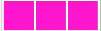 |
| spaceAround | 和spaceEvenly差别:首尾间距减半 | 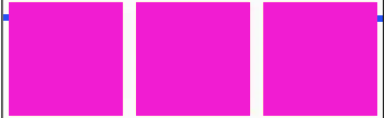 |
| spaceBetween | 和spaceEvenly差别:首尾没间距 | 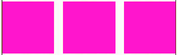 |
Wrap
Row、Column只能单行、单列排列。 Wrap突破单行、单列限制,当mainAxis空间不足时则向crossAxis上扩展显示。
属性
| 属性 | 类型 | 作用 |
|---|---|---|
| direction | 排列方向 | |
| spacing | double | 垂直间隔 |
| runSpacing | double | 行间隔 |
| alignment | WrapAlignment | 主轴对齐方式 |
| runAlignment | WrapAlignment | 整体(所有子组件看作一起)对齐方式 |
| crossAxisAlignment | WrapCrossAlignment | 副轴对齐方式 |
| verticalDirection | children摆放顺序,默认时VerticalDirection.down |
Stack
Stack其内子widget按照先后顺序层叠排列。
Positioned
Positioned用于在Stack进行绝对定位(通过left、top、right、bottom设置位置)
定位四个角及相应坐标
左上角:left=0、top=0
右上角:right=0、top=0
左下角:left=0、bottom=0
右下角:right=0、bottom=0
Positioned必须设置width、height,或者子widget具备设置宽高
width、height设置子widget宽高。不能使用ouble.infinity/maxFinite,可以通过MediaQuery.of(context).size获取到屏幕宽高。
文本、表单
Text
属性
| 名称 | 功能 |
|---|---|
| textAlign | center、left、right、justfy(两端对齐) |
| textDirection | ltr从左到右、rtl从右到左 |
| overFlow | 文字超出后的处理方式(clip、fade、elipsis) |
| textScaleFactor | 字体显示缩放因子 |
| style | TextStyle(color,/*颜色*/ backgroundColor,fontSize,fontWeight,/*加粗*/fontStyle, decoration,/*文字装饰线(none没有线,lineThrough删除线,overline上划线underline下划线)*/ decorationColor,/*文字装饰线颜色*/ decorationstyle,*文字装饰线风格/([dashed,dotted]虚线,double两根线,solid一根实线wavy波浪线)*/ letter/wordSpacing,/*字母/单词间隙(如果是负值,会让字母变得更紧凑)*/) |
| maxLindes |
TextField
属性
| 名称 | 类型 | 描述 |
|---|---|---|
| controller | TextEditingController | 控制输入框的文本内容,可以通过TextEditingController进行管理。 |
| decoration | InputDecoration | 输入框的装饰,可以定义输入框的边框、背景、提示文本等样式。 |
| obscureText | bool | 是否将输入内容隐藏,常用于密码输入框。 |
| enabled | bool | 输入框是否可编辑。 |
| maxLength | int | 允许输入的最大字符数。 |
| textInputAction | TextInputAction | 键盘操作按钮的类型,例如完成、继续等。TextInputAction值: none、unspecified、done、go、search、send、next、previous、continueAction、join、route、emergencyCall、newline |
| keyboardType | TextInputType | 键盘的类型,如文本、数字、URL等。TextInputType: text, multiline, number, phone, datetime, emailAddress, url, visiblePassword, name, streetAddress, none |
| onChanged | 文本变化时的回调函数。 | |
| onSubmitted | 用户提交输入时的回调函数。 | |
| focusNode | 用于控制输入框的焦点获取和失去。 | |
| autofocus | 是否自动获取焦点。 | |
| style | TextStyle | 输入框文本的样式,如字体大小、颜色等。 |
图片
Image
属性
| 属性 | 类型 | 描述 |
|---|---|---|
| fit | BoxFix | fit属性用来控制图片的拉伸和挤压,这都是根据父容器来的。 BoxFit枚举: fit:填充满父容器,图片会被拉伸。 contain:按原比例显示,可能会有空隙。 cover:显示可能拉伸,可能裁切,充满(图片要充满整个容器,还不变形)。 fitWidth/fitHeight:宽/高充满(横向充满),显示可能拉伸,可能裁切。 scaleDown:效果和contain差不多,但是此属性不允许显示超过源图片大小,可小不可大。 |
| alignment | Alignment | 图片的对齐方式 |
| repeat | ImageRepeat | ImageRepeat枚举: repeat:横向和纵向都进行重复,直到铺满整个画布。 repeatX/Y:横向/纵向重复,纵向不重复。 |
| width/height | double | 结合ClipOver组件(父节点)使用 |
加载本地图片:Image.asset
项目跟目录下建立一个文件夹images->建立各分辨率文件夹(2.0x、3.0x)->存放图片
配置pubspec.yaml并将各分辨率的图片都列举在下面(列举文件夹就可以了)
1
2
3
4
assets:
    - images/
    - images/2.0x/
    - images/3.0x/
加载:Image.asset("images/haha.png")
加载网络图片:Image.network
圆角图片的两种方式
1
2
- 1.用Container包裹通过`decoration`设置`borderRadius`、image(背景图,NetworkImage/AssetImage)
- 2.ClipOver包裹设置Image的宽高
CircleAvatar
实现圆形图片(不需要制定宽高)
属性
| 属性 | 类型 | 作用 |
|---|---|---|
| radio | double | 半径 |
| backgroundImage | Widget | 子Image |
实现圆形图片的其他方式
- 1.ClipOval/ClipRRect,Image需设置宽高
1
2
3
4
5
6
7
8
9
ClipRRect(
    borderRadius: BorderRadius.circular(120),
    child: Image.network(
        'https://avatars.githubusercontent.com/u/4121662?v=4',
        fit: BoxFit.cover,
        width: 120,
        height: 120,
    )
)
2.Container.
decoration.image结合DecorationImage1 2 3 4 5 6 7 8 9 10 11
Container( width: 100,//宽高比许设置 height: 100,// decoration: BoxDecoration( borderRadius: BorderRadius.circular(150), image: DecorationImage( image: NetworkImage('xhttps://avatars.githubusercontent.com/u/4121662?v=4'), fit: BoxFit.cover ) ) )
3.PhysicalModel
1
2
3
4
5
6
7
8
9
10
11
  PhysicalModel(
      color: Colors.transparent,
      clipBehavior: Clip.antiAlias,
      elevation: 5.0,
      shape: BoxShape.circle,
      child: Image.network('https://avatars.githubusercontent.com/u/4121662?v=4',
      width: 120,
      height: 120,
      fit: BoxFit.cover,
      )
  )
4.Card
1
2
3
4
5
6
7
8
9
10
11
  Card(
  shape: const CircleBorder(),
  clipBehavior: Clip.antiAlias,
  elevation: 5,
  child: Image.network(
      'https://avatars.githubusercontent.com/u/4121662?v=4',
      width: 120,
      height: 120,
      fit: BoxFit.cover,
  ),
  )
Icon
一.内置图标
内置图标用Icon widget加载
1
Icon( Icons.search, color:Colors.red,size:40)
二.自定义图标
- 使用自定义图标步骤
- 1.导入字体图标文件.比如存放路径为
fonts/iconfont.ttf - 2.配置
pubspec.yaml下的fonts
1
2
3
4
  fonts:
      - family:myIcon #指定字体名
          fonts:
              - asset:fonts/iconfont.ttf
- 3.定义图标常量
1
2
3
4
5
6
7
8
  class MyIcons{
      static const IconData book =IconData(
          0x3614,             //编码
          fontFamily:'myIcon',
          matchTextDirection:true
      );

  }
- 4.在
Icon组件y调用MyIcons中地图标
- 1.导入字体图标文件.比如存放路径为
按钮
TextButton
属性
属性|类型|描述 —|—|—
ElevatedButton
属性
属性|类型|描述 —|—|—
Switch
属性
| 属性 | 类型 | 描述 |
|---|---|---|
| value | bool | 是否选中 |
| onChanged | void Function(bool) | 选中状态改变时回调 |
SwitchListTile
实际就是用ListTitle包裹了Switch
属性
| 属性 | 类型 | 描述 |
|---|---|---|
| value | bool | 是否选中 |
| onChanged | void Function(bool) | 选中状态改变时回调 |
| title | Widget | 对照ListTile |
| subtitle | Widget | 对照ListTile |
| controlAffinity | ListTileControlAffinity | Switch显示位置: leading:对照ListTile trailing:对照ListTile platform |
Checkbox
属性
| 属性 | 类型 | 描述 |
|---|---|---|
| value | bool? | 状态 |
| tristate | bool | null是否是一种状态 |
| onChanged | void Function(bool?) | 选中状态改变时回调 |
SwitchListTile
跟SwitchListTile差不错样式的东西
属性
属性|类型|描述 —|—|—
DropdownButton
属性
| 属性 | 类型 | 描述 |
|---|---|---|
| value | int | 当前选中 |
| items | List<Widget> | 下拉菜单widget |
| selectedItemBuilder | List<Widget> | 显示选中菜单的widget |
| onChanged | void Function(bool) | 选中状态更改回调 |
实例
1
2
3
4
5
6
7
8
9
10
11
12
13
DropdownButton(
    value:_selectIndex,
    selectedItemBuilder:(ctx)=>[
        DropdownMenuItem(value:1, child: Text("u chose item1"),),
        DropdownMenuItem(value:2, child: Text("u chose item2"),),
        DropdownMenuItem(value:3, child: Text("u chose item3"),),
    ],
    items: const [
        DropdownMenuItem(value:1, child: Text("item1"),),
        DropdownMenuItem(value:2, child: Text("item2"),),
        DropdownMenuItem(value:3, child: Text("item3"),),
    ],
    onChanged: (value)=>print("DropdownButton changed $value"))
列表
ListView
属性
| 属性 | 类型 | 描述 |
|---|---|---|
| scrollDirection | Axis | 默认垂直Axis.vertical.horizontal |
| padding | EdgeInsetsGeometry | |
| resolve | 列表反向排序 | |
| children | List<Widget> | 列表元素 |
ListView的children为Container
Container的宽度在vertical列表中自动填充ListView宽度;高度在horizontal列表中则高度自动填充ListView高度
ListView三种构造方法
- 1.ListView(children:for循环构造子widget)
- 2.ListView.builder(itemCount,itemBuilder(context,index))
ListTitle
常用来构造ListView的子项。
属性
| 属性 | 类型 | 描述 |
|---|---|---|
| title | Widget | 主标题 |
| subtitle | Widget | 副标题 |
| leading | Widget | 左组件。常用于显示icon |
| tailing | Widget | 右组件。常用于显示icon |
Divider
分隔线
GridView
属性
| 属性 | 类型 | 描述 |
|---|---|---|
| scrollDirection | Axis | 主轴滚动方向 |
| padding | ||
| resolve | bool | 反转列表 |
| mainAxisSpacing | double | 主轴子widget间距 |
| crossAxisSpacing | double | 副轴子widget间距 |
| maxCorssAxisExtent | double | 主轴子widget最大长度 用在GridView.extent中控制横轴子widget最大长度 |
| crossAxisCount | int | 副轴子widget数量 |
| childAspectRatio | double | 子widget宽高比 |
| gridDelegate | 用在GridView.Builder中控制布局 1.SliverGridDelegateWithFixedCrossAxisCount:对应GridView.count 2.SliverGridDelegateWithMaxCrossAxisCount:对应GridView.extent |
三种构造方法
1.GridView.cout(corssAxiscount,children)
2.GridView.extent(maxCorssAxisExtent,children)
3.GridView.builder(gridDelegate,itemCount,itemBuilder(context,index))
AnimatedList 实现动态列表
AnimatedList和ListView功能差不多,但AnimatedList在列表插入、删除节点时执行 一个动画,提高用户体验。
添加、删除元素用到 AnimatedListState 的两个方法
insertItem(index,{duration})
removeItem(index,AnimatedListRemovedItemBuilder builder,{duration})
1
2
3
4
5
6
7
8
9
10
11
12
13
14
15
16
17
18
19
20
21
22
23
//创建
AnimatedList(
    key:_globalKey,
    initialItemCount: list.length,
    itemBuilder:( (ctx,i,animation)=>FadeTransition(opacity:animatiion,child:_buildItem(i)) )
)
//添加
list.add(xxx);
_globalKey,currentState!.insertItem(list.length-1);

//删除
if(canDel){
    canDel=false;
    _globalKey.currentState!.removeItem(i,(ctx,animation){
        var item=_buildItem(i);//创建要删除的item
        list.removeAt(i);
        return FadeTransition(opcity:animation,child,item);
    });
    Timer.periodic(Duration(milliseconds:500),(timer){
        canDel=true;
        timer.cancel();
    });
}
PageView
PageView用于实现轮动图或上下滑动切换视图
属性
| 属性 | 类型 | 作用 |
|---|---|---|
| scrollDirection | Axis | 滚动方向 |
| allowImplicitScrolling | int | 缓存当前页面的前后两页 |
| onPageChanged | ||
| controller | PageController | 控制PageView滚动 |
实现PageView无限滚动
老掉牙的东西。基本做法:
- 1.设置无限大的itemCount
- 2.构造Widget时通过取模的方法获取到实际索引
缓存页面
内部子widget混入AutomaticKeepAliveClientMixin
对话框
Dialog
1.弹出
对话框通过 showDialog函数来显示
| 参数 | 类型 | 作用 |
|---|---|---|
| context | ||
| builder | WidgetBuilder | 回调构建Dialog |
| barrierDismissible | bool | 点击遮罩是否消失 |
2.取消显示
Navigator.pop(context)
3.返回值设置
Navigator.pop(context,returnValue)
4.获取返回值
final result = await showDialog(context,....)
自定义Dialog
- 1.继承
Dialog
继承Dialog重写build函数.
- 2.设置背景色
Dialog本质就是一个页面,所以自定义的Dailog会填充满屏幕,背景为白色遮住当前页面。
1
2
//设置 dialog 半透明,顶层Material包裹
Material.type=MeterialType.transparency
AlertDialog
属性
| 属性 | 类型 | 作用 |
|---|---|---|
| icon | Widget | |
| title | Widget | |
| content | Widget | |
| actions | List | 左下角button |
实例
1
2
3
4
5
6
7
8
9
10
11
final String? r=await showDialog(
    context: context,
    builder: (ctx) => AlertDialog(
            title: const Text("title"),
            content: const Text("content"),
            actions: [
            ElevatedButton(
                onPressed: () => Navigator.pop(context, "Ok"),
                child: const Text("Ok"))
            ]
        ));
SimpleDialogOption
SimpleDialog
实例
1
2
3
4
5
6
7
8
9
final int? r=await showDialog(
    context: context,
    builder: (ctx) => SimpleDialog(
        title:  const Text("Chose Options"),
        children: [
        SimpleDialogOption( child: const Text("option1"),onPressed:()=> Navigator.pop(context,1) ),
        SimpleDialogOption(child: const Text("option2"),onPressed:()=>Navigator.pop(context,2) ),
        ],
    ));
BottomSheet
showBottomSheet
showModalBottomSheet
实例
1
2
3
4
5
6
final bool? r=showModalBottomSheet(
    context: context,
    shape: RoundedRectangleBorder(borderRadius: BorderRadius.circular(10)),
    builder: (ctx) => Padding(
        padding: const EdgeInsets.all(10),
        child: Text(content)));
菜单
PopupMenuButton
弹出菜单按钮
实例
1
2
3
4
5
6
7
8
9
10
PopupMenuButton(
        icon: const Icon(Icons.more_vert),
        onSelected: (value)=>print("your clicked $value"),
        initialValue: 2,
        itemBuilder: (ctx)=><PopupMenuEntry>[
            const PopupMenuItem(value: 1,child:Text("Open"),),
            const PopupMenuItem(value: 2,child:Text("Edit"),),
            const PopupMenuItem(value: 3,child:Text("About"),),
        ]
    )
PopupMenuItem
PopupMenuButton子项
实例
1
PopupMenuItem(value: 1,child:Text("Open"),)
CheckedPopupMenuItem
PopupMenuButton多选子项
实例
1
CheckedPopupMenuItem(value: 1,child:Text("option1"),checked:true)
PopupMenuDivider
菜单分隔线
实例
1
PopupMenuDivider()
动画
一.隐式动画
隐式动画隐藏了动画背后的实现原理和繁琐的操作细节。
属性
| 属性 | 类型 | 作用 |
|---|---|---|
| duration | Duration | 动画时长 |
| curve | Curve | 动画运动曲线 |
| child | 子widget | |
| onEnd | VoidCallback | 动画结束回调 |
隐式动画表
| 动画 | 效果 | 其他 |
|---|---|---|
| AnimatedContainer | 包装自Container,改变Container里的属性执行动画 | |
| AnimatedPadding | 包装自Padding,改变Padding属性执行动画 | |
| AnimatedPositioned | 包装自Positioned,改变Positioned属性执行动画 | |
| AnimatedOpacity | 包装自FadeTransition,改变opacity执行动画 | |
| AnimatedDefaultTextStyle | textStyle属性改变时执行动画 | 实例 |
| AnimatedSwitcher | 子组件更改时执行动画 | 实例 类型改;或同一组件设置 key=UniqueKey那么属性改变也会执行 |
AnimatedDefaultTextStyle例子
1
2
3
4
5
AnimatedDefaultTextStyle(
    duration:Duration(seconds:2),
    style:TextStyle(fontSize:change? 20:40)
    child:const Text("gold.duo")
)
AnimatedSwitcher例子
1
2
3
4
5
AnimatedSwitcher(
    duration:const Duration(seconds:2),
    child: !load? const CircularProgressIndicator() : Image.network("https://avatars.githubusercontent.com/u/4121662?v=4"),
    transitionBuilder:(child,animation)=> ScaleTransition(scale:animation,child: FadeTransition(opacity: animation,child: child))
)
二.显式动画
显式动画是需要手动设置动画的时间,运动曲线,取值范围的动画.
显式动画需配合AnimationController(需 Mixins SingleTickerProviderStateMixin)。AnimationController方法
| 名称 | 作用 |
|---|---|
| repeat | 重复播放 |
| forward | 顺序播放 |
| reverse | 逆序播放 |
| stop | 停止 |
| reset | 重置到初始状态 |
| animateTo | 动画执行到制定值[0,1] |
| animateBack | 动画回滚到制定值 |
| drive | 将Tween(或 CurveTween)链接到此动画 controller.drive(Tween(begin:0.2,end:0.8)) |
| addListener | 监听动画值([0,1])变化 |
| addStatusListener | 监听动画状态变化 |
若不调用repeat、forward、reverse,AnimationController实例赋值给xxTransition后并不会执行动画
显式动画表
| 动画 | 效果 | 设置属性 | 实例 |
|---|---|---|---|
| RotationTransition | 对子组件旋转 | turns | - |
| FadeTransition | 对子组件渐隐渐现 | opacity | - |
| SliverFadeTransition | |||
| ScaleTransition | 对子组件放大缩小 | scale | - |
| SlideTransition | 左右切换滑动 | position | 向右移动50%*width: 1.controller.drive(Tween(begin:const Offset(0,0),end:const Offset(0,5,0))) 2.Tween(begin:const Offset(0,0),end:const Offset(0,5,0)).animate(controller) Offset里构造的参数不是坐标而是相对自身大小的倍数 |
| SizeTransition | |||
| PositionedTransition | |||
| RelativePositionedTransition | |||
| AlignTransition | |||
| DefaultTextStyleTransition |
1
2
3
4
5
6
7
8
9
10
11
12
13
  late AnimationController _controller;
  late Animation<double> _animation;
  void initState() {
    super.initState();
    _controller=AnimationController(vsync: this,duration:  const Duration(seconds: 1));
    _animation =Tween<double>(begin: 0.0, end: 1).animate(_controller);
    _controller.forward();
  }

  @override
  Widget build(BuildContext context)=>FadeTransition(
    opacity: _animation,
    child:const Text('FadeTransition'));
修改Tween的运动方式
1
2
3
4
Tween(begin:const Offset(0,0),end:const Offset(0,5,0))
.chain(CurveTween(curve:Curves.bounceIn)) //弹跳曲线
.chain(CurveTween(curve:const Interval(0.8,1))//运动到80%暂停,然后完成20%
.animate(controller)
交错动画
AnimationIcon(图标从 A -> B)
1
2
3
4
5
 AnimatedIcon(
    icon:AnimatedIcons.menu_arrow,
    size:40,
    progress:_controller
)
Interval控制动画交错播放
Interval构造传入begin、end,分别代表在动画总时间的某个百分比执行改动画。 所以构造不同的begin、end序列的widget执行动画即所谓的交错执行。
三.Hero
实现点击某一个widget飞入切换到另外一个页面效果(类似微信点击朋友圈点击小图预览大图),关闭也自动产生飞出效果。
实例
1
2
3
4
5
6
7
8
9
10
11
12
13
14
15
16
17
18
19
20
21
22
23
24
25
26
27
28
29
const url='https://avatars.githubusercontent.com/u/4121662?v=4';

//1.原widget用Hero包裹
class HomePage extends StatelessWidget{
    Widget build(BuildContext context)=>Center(child:InkWell(
    onTap: ()=>Navigator.pushNamed(context, '/search', arguments:url),
    child: Hero(tag: url,
        child: SizedBox(
            width: 50,
            height: 50,
            child: Image.network(url,fit:BoxFit.cover))),
    ));
}

// 2.目标页也用Hero包裹切Hero.tag一定要设置相同的url
class SearchPage extends StatelessWidget{
    Widget build(BuildContext context) {
    final String url = (ModalRoute.of(context)?.settings?.arguments ?? "") as String;
    return Center(child:GestureDetector(
        onTap: () => Navigator.pop(context),
        child: Hero(
            tag: url,
            child: Scaffold(
                body: Center(
                child: Image.network(url, fit: BoxFit.cover),
                )
            ))));
    }
}
其他
Stepper
步骤显示器。典型的物流状态、订单状态、审批流程状态
属性
| 属性 | 类型 | 作用 |
|---|---|---|
| steps | Step | |
| physics | ||
| type | StepperType | 横向还是纵向 |
| currentStep | int | 当前 step |
| onStepTapped | void Function(int value) | step 点击回调函数 |
| onStepContinue | void Function() | Next 按钮点击回调函数 |
| onStepCancel | void Function() | Cancel 按钮点击回调函数 |
| controlsBuilder | Widget Function(BuildContext context, ControlsDetails details) | 内容下方按钮构建函数 |
| 属性 | 类型 | 作用 |
|---|---|---|
| title | Widget | 标题 |
| subtitle | Widget | 副标题 |
| content | Widget | 内容 |
| state | StepState | 当前 step 的状态,StepState 会改变每一个 step 的图标,默认为 StepState.indexed |
| isActive | bool | 是否激活状态,默认为 false,isActive == true 时会变成蓝色 |
Visibility
属性
| 属性 | 类型 | 作用 |
|---|---|---|
| replacement | Widget | 不可见时显示的组件(当maintainState=false) |
| visible | bool | 子组件是否可见,默认true(可见) |
| maintainState | bool | 不可见时是否维持状态,默认为false |
| maintainAnimation | bool | 不可见时,是否维持子组件中的动画 |
| maintainSize | bool | 不可见时是否留有空间 |
| maintainSemantics | bool | 不可见时是否维持它的语义 |
| maintainInteractivity | bool | 不可见时是否具有交互性 |
PopScope
属性
| 属性 | 类型 | 作用 |
|---|---|---|
| canPop | bool | 当canPop为true,走系统路由, onPopInvoked的didPop为true 当canPop为false,不走系统路由,onPopInvoked的didPop为false |
| onPopInvoked | void Function(bool didPop) | 回调 |